
October 2016
October 27, 2016
What's up (and down) with Labor Force Participation in the District?
The Labor Force Participation Rate in the US has been steadily decreasing since peaking in 2000 at over two-thirds of the adult civilian population. Today, that figure for the US as a whole is around 63%. That means about 93 million people working-age people in the US are neither working nor looking for work. The Labor Force Participation rate is a measure of who is in the labor force. It includes both those employed and those unemployed and searching for work. People out of the labor force may be out for different reasons – they may be homemakers, they could be prevented from working because of a medical condition, they may be retired, full-time students, or they may be so-called “discouraged” workers who have given up looking for a job. In DC, where we have been creating jobs at a pace of over 10,000 per year for the last several years, the Labor Force Participation rate has increased overall. More jobs available may mean lower barriers to employment for DC residents. Plus, we’ve gained population, and people moving to the District for jobs are participating in the labor force. We can look to the US Census’ American Community Survey to explore labor force participation in more detail. The chart below uses survey samples to compare two recent time periods in DC, one from 2006-2010 and another from 2010-2014. Since this is sample data, we need to take into account the margin of error when assessing whether positive or negative changes have happened. Looking by Ward, we can see that the Labor Force Participation rate has remained roughly the same or actually increased in seven of our eight Wards. Ward 7 is the clear outlier here; the proportion of Ward 7 residents in the labor force went down.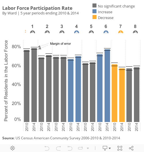
We can look a bit deeper at Ward data to see which demographic groups are driving the fluctuations. In the chart below, selecting a Ward and a Demographic Type will show data broken down by group and topic. The bars in blue and orange show the increase or decrease in Labor Force Participation Rate for each group. The skinnier the bar, the fewer people there are in the overall Ward population. The color shows how impactful that group was in driving the overall trend in the Ward.
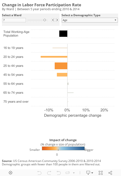
In Ward 7, unlike other Wards in the city, males are driving the participation decrease. Males in Ward 7 dropped out of the labor force in a fashion that had a significant impact on the Ward's participation rate. In Ward 7, where the majority of the population is Black/African-American the labor force participation is decreasing among this population, which has an almost equally large impact on the rate. So we can infer that the demographic driving this change in Ward 7 is primarily Black males. The decrease is about equally spread out among different education levels. The change does not necessarily mean that people in Ward 7 are dropping out of the labor force at a high clip. It could also mean that, due to migration, Ward 7 is gaining fewer participants (e.g. full-time students), or that participants are moving elsewhere. The rate only refers to the proportion of the population as a whole within the survey time periods. This is not a common trend within the rest of the city – in six of eight Wards the labor force participation rate grew or held steady for African Americans, and the same for males. In future analysis, we will explore more data to see what is driving these economic and demographic changes. Stay tuned.
October 11, 2016
Doing More with More: Putting Affordable Housing Dollars to Work
Since taking office, the Bowser Administration has invested $100 million annually into the Housing Production Trust Fund, which is one of several sources of financing for building new affordable housing and preserving existing affordable units. The Trust Fund is written into the DC Code. Every year, at least half the spending (via loans, grants, and gap financing) must go toward funding affordable rental units. 40% of the spending every year must go toward units which are set aside for very low-income households, or those making at most 50% of the Area Median Income (AMI). Another 40% of the spending must go to units for extremely low-income households, or those that make less than 30% of AMI. You can find the income limits for FY16, by household size, posted by the US Department of Housing and Urban Development (HUD) here.A recent report by the Housing Trust Fund Project, a unit of the Center for Community Change, assessed the state of housing trust funds around the country. 49 states (plus DC) have established such funds. There are also city-level funds established in 35 states, and county-level funds established in 12 states. DC’s Trust Fund stands out.
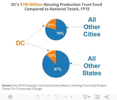
Though the report (rightly) counts DC as a state, if it were a city fund, DC’s investment accounted for over 1/5 of the total city Housing Trust Fund total invested nationwide in fiscal year 2015. Among states, DC’s $100 million investment made up over 1/8 of all state trust fund investments in fiscal year 2015. Among states, only Florida has a larger trust fund with $175 million invested in 2015.
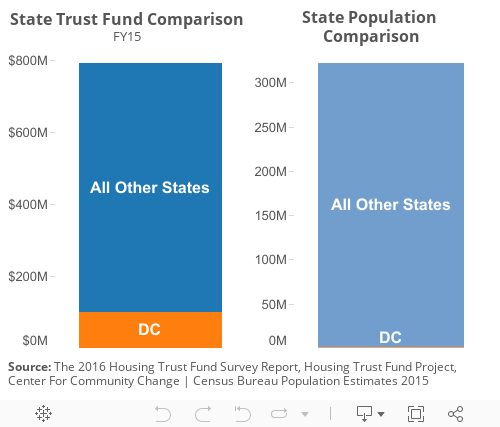
Accounting for population, DC’s investment seems even more extraordinary. Comparing the housing investment in DC to the District’s population, it’s clear that we’re making a larger per-capita investment than any other state, as shown in the chart below.
The Trust Fund is a dedicated source of funds for affordable housing as DC deals with booming population growth projections and rapidly changing neighborhoods. And it’s not just the investment that matters – it’s getting the money out the door and in the hands of organizations which are on the ground producing and preserving affordability for DC residents. That’s why we’re also proud to report that fiscal year 2016 (which just ended on September 30) was the first year the Department of Housing and Community Development (DHCD), which administers the Fund, also spent $100 million from the HPTF within one fiscal year. You can see data – updated monthly – on our pipeline of affordable housing projects in the District here on DMPED’s dashboard. These projects include both HPTF-funded affordable housing, and housing which received other types of financing, like Low Income Housing Tax Credits, Federal grant funding, and land value write-downs. Other affordable housing units are produced via the Inclusionary Zoning program, which mandates a portion of all new developments (both for-sale and for-rent) in certain areas include affordable units.
October 3, 2016
Income: Taking it Personal
We track DC’s Personal Income because it represents the money District residents earn whether they work in DC or elsewhere. Personal Income is hardly “personal,” though – this metric aggregates up all incomes received by all DC residents. Our GDP, on the other hand, measures the value of all goods and services produced within the District, including both residents and non-residents. Use of both figures allow us to track our economy over time and better understand where our residents make a living. Growth in our Personal Income reflects more income earned by DC residents.Personal Income represents residents’ income from all sources: from a job, from owning a home, from owning financial assets or from government benefits like Social Security. GDP, or gross domestic product, is the sum of what all consumers, businesses and government agencies spend on goods and services. DC’s GDP represents the overall strength of the economy located in DC, while Personal Income reflects the economic power of DC’s households.
In DC, Personal Income has been growing at a rate faster than the US as a whole, as shown in the first chart. This is due in large part to some major population growth in DC – more people means more income. Among states, DC saw the greatest change in Personal Income between 2016 Q1 and Q2.
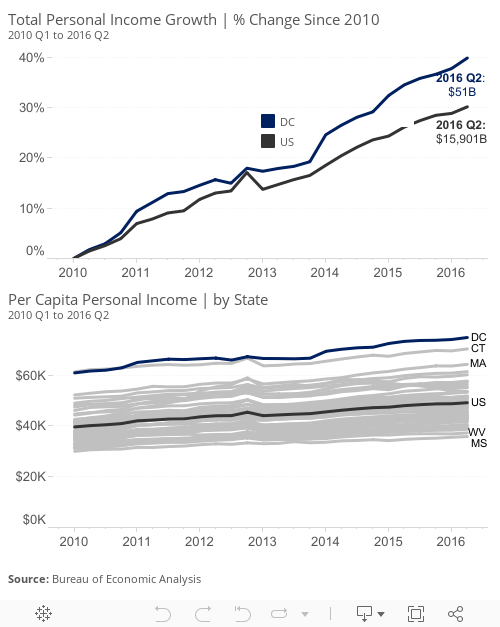
This state vs. city data effect can also be seen in the components of Personal Income. In 2016 Q2, net earnings from jobs & labor for residents in DC grew at a pace slower than 8 other states, even though as a whole DC’s Personal Income growth exceeded all states. The component of Personal Income which grew the most in DC was “transfer receipts,” which counts government benefits like retirement and disability insurance benefits (mainly Social Security), medical benefits (mainly Medicare and Medicaid), income maintenance benefits, unemployment insurance compensation, veterans’ benefits, and federal education and training assistance. The rate of growth of transfer receipts in DC was more in line with US metropolitan areas in the US, and less similar to the rates of growth in areas that are rural or suburban.